The Brief:
UTS Info Day is an event in which prospective undergraduate students get to have a first-hand experience at university life. The event is normally advertised via printed brochures but as more applicants becoming web-savvy, it was decided that an online presence advertising this event would be as effective as – if not more so than – printed materials.
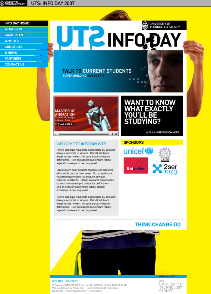
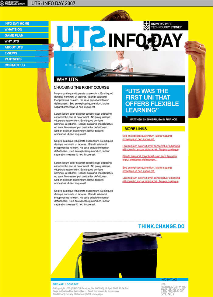
The main challenge of the design was to incorporate the stark yellow, blue, and black colors from the brochure. The site also needs to have a brochure-like feel so that users will be reminded of the printed material should they have seen one beforehand. In addition to this, a logo for the event has been provided and must be used prominently throughout the site.
Design Approach:
One of the defining characteristics of the brochures apart from the colors was the constant use of quotes from current students describing their experience at UTS. Because of this, it was decided that the site will incorporate these quotes as part of the design elements as well as the main component of its layout.
For the primary background, a shot of a guy holding an announcement will be used. Although due to the length of the content, there’s an uncanny effect of the person looking like he has an elongated limbs. Much to our surprise, the client was very happy despite of this and believed that the site captured the fun yet informative feel of the UTS Open Day itself.


