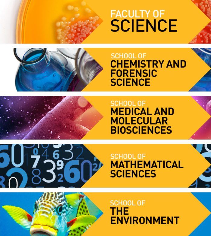
The Brief:
UTS website recently underwent a major rebranding of its site. Due to the lack of staff available within the web team, most of whom busy maintaining previous iterations of the website, the site redesign were outsourced to an external company.
However, web team was still responsible to put on the finishing touch, which includes creating banners for different faculty pages. Therefore the task at hand is to incorporate the new design and the ‘look’ that each faculty wish to convey on their pages.
Design Approach:
The challenge of this seemingly-simple task was mostly dealing with different demands and needs of each faculty while maintaining design consistency from banner to banner. Unfortunately, sometimes office politics won over the need to have site consistency.
Having said that, I’m pretty happy with the result and the general design process. In general, I was able to experiment with several interesting imagery and concepts while fulfilling the brief and working around the restrictions from each faculty.


